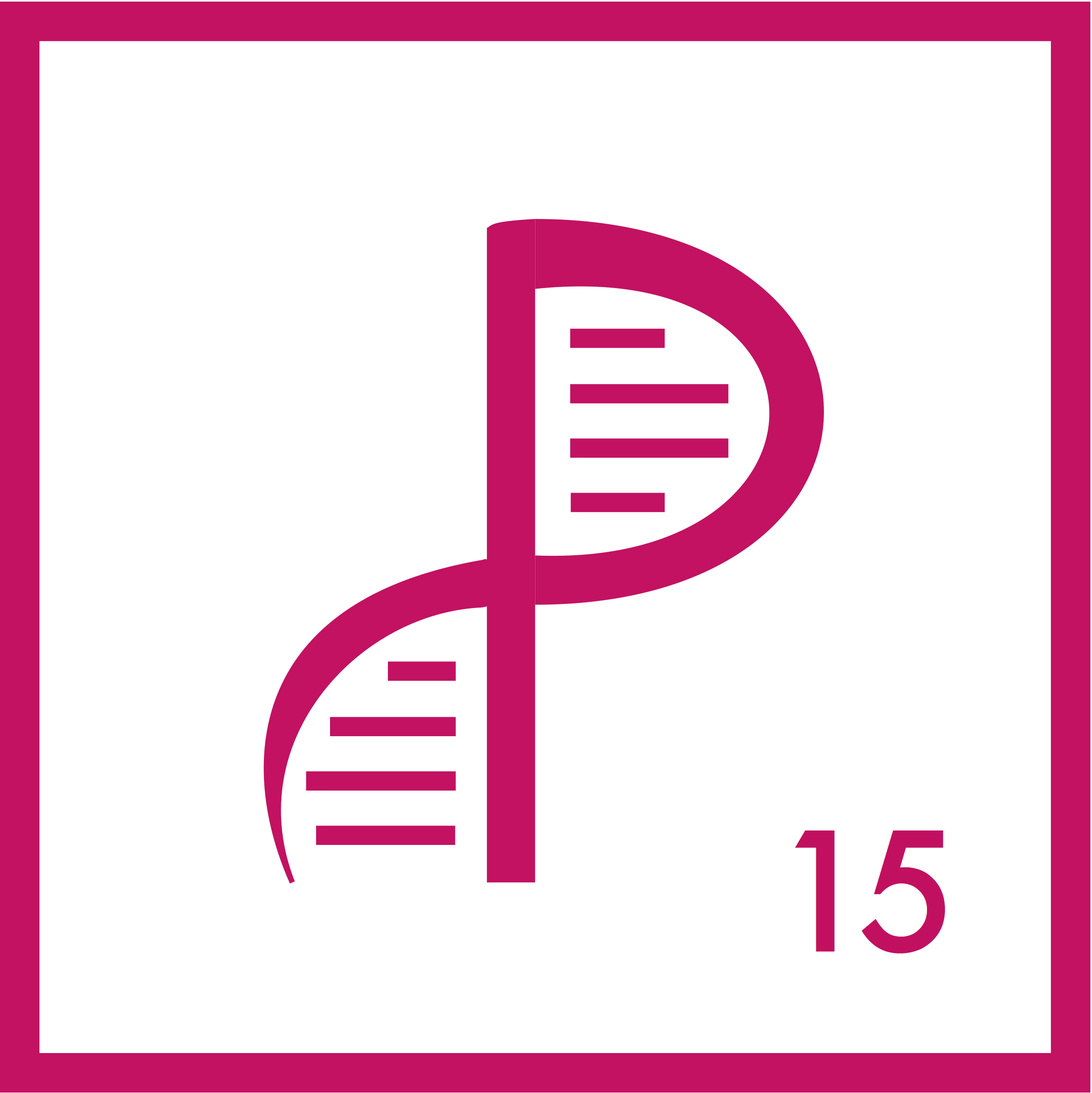
At Phosphorus, my focus was building software to analyze genetic sequencing data. I can’t share any of the code I developed there, but I can share the process behind something I made: the logo.
Here’s where it began. I was trying to convey Phosphorus’ place on the periodic table (the atomic number 15), and the fact that we were doing genetic tests (hence the DNA double helix).
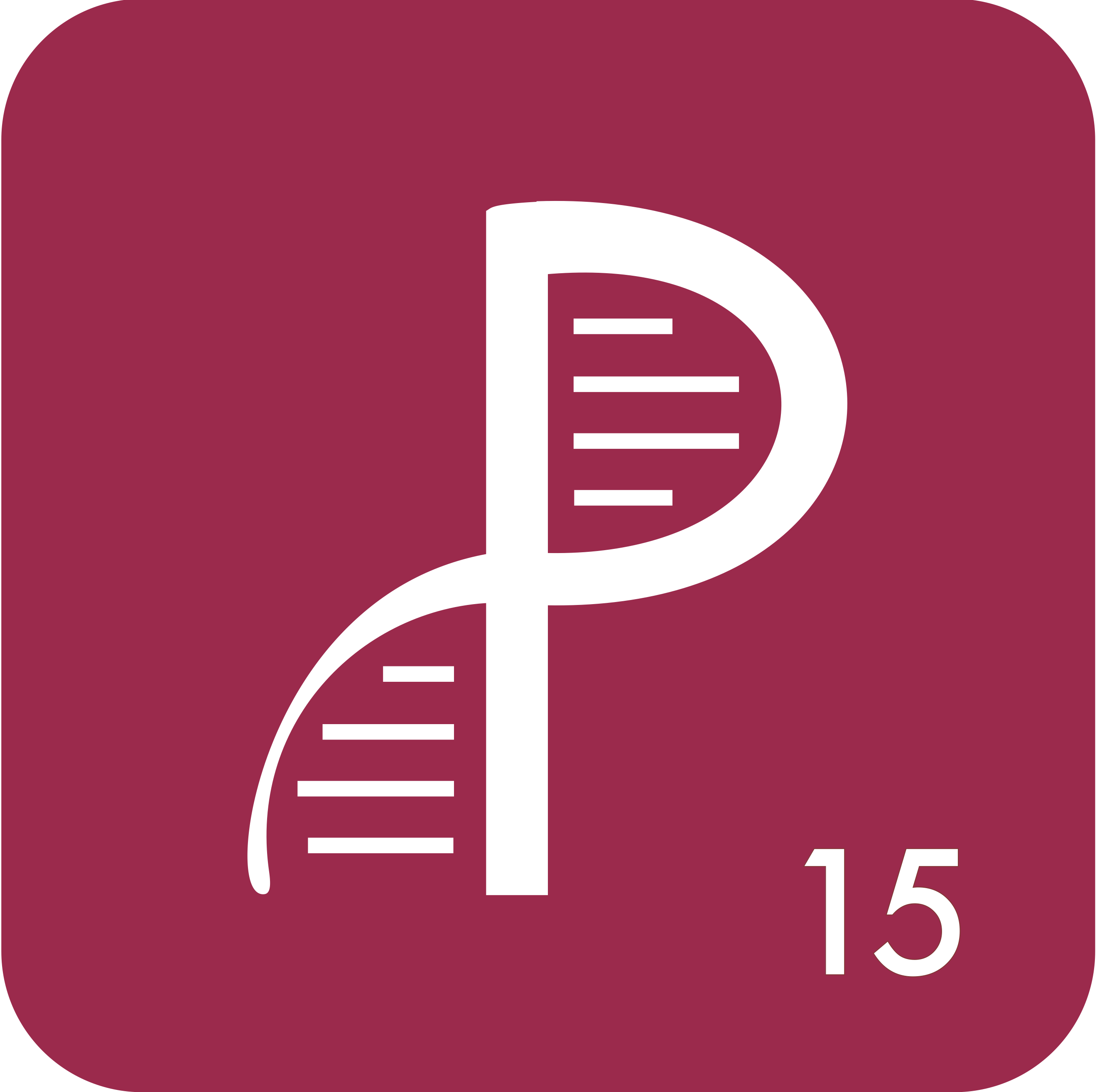
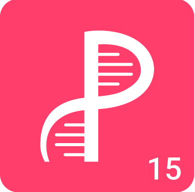
Since then, the design evolved. The colors became brighter, and the lines connect to only one side.
It’s cool seeing your logo on the web, but my favorite spot I’ve seen the logo I made is on a cupcake.